D&D 5E Toward a new D&D aesthetics

What is your feeling about the changes in aesthetics of D&D illustrations?

  • I really enjoy those changes. The illustrations resemble well my ideal setting!

  • I'm ok with those changes, even if my ideal setting has a different aesthetics.

  • I'm uncertain about those changes

  • I'm not ok with those changes because it impairs my immersion in the game.

  • I hate those changes, I do not recognize D&D anymore

  • The art doesn't really matter to me either way. I don't buy/play the game for the art.

  • Change in aesthetics? Where? What?


Results are only viewable after voting.
Status
Not open for further replies.
"Classic" is not a useful term here, because the variety of art in past editions of D&D is huge. It's too vague a term to be useful in defining what you actually mean - it's not an art style, it's a large group including a wide variety of art styles.
I think it's clear he means the opposite of Disneyfied. Elements of sex, violence, etc.
 

log in or register to remove this ad

TerraDave

5ever, or until 2024
Is this about Strixhaven and (what we have seen) of Radiant? 2 books? Or just the 1?

D&D has had bigger experimentation in art. Dragon Lance (at the time), Darksun, and especially Planescape, for example.

And sure they were all better than Strixhaven art wise, but can you draw such big conclusions from 1 book?


Where the monsters don't look blatantly Disneyfied.
I can't take your response very seriously because nothing in the cover art resembles anything from the early, middle, or current disney/pixar art style.

The early, (Snow white, sleeping beauty, dumbo, etc) and middle periods (beauty and the beast, aladin, the little mermaid, etc), had a VERY clearly established art aesthetic but that has changed so much in the last 20 years that I don't think we can even speak of a unified Disney "look" anymore.

Unless you're just using Disney as a pejorative in which case I REALLY can't take you seriously since Disney as been at the tip top of art and animation for more than twice as long as I've been alive.
 

I can't take your response very seriously because nothing in the cover art resembles anything from the Early, middle, or current disney/pixar art style.

The early, (Snow white, sleeping beauty, dumbo, etc) and middle periods (beauty and the beast, aladin, the little mermaid, etc), had a VERY clearly established art aesthetic but that has changed so much in the last 20 years that I don't think we can even speak of a unified Disney "look" anymore.

Unless you're just using Disney as a pejorative in which case I REALLY can't take you seriously since Disney as been at the tip top of art and animation for more than twice as long as I've been alive.
I'm pretty sure you know what this poster is saying. Passive aggressiveness never wins the race.


beancounter

(I/Me/Mine)
I can't take your response very seriously because nothing in the cover art resembles anything from the early, middle, or current disney/pixar art style.

The early, (Snow white, sleeping beauty, dumbo, etc) and middle periods (beauty and the beast, aladin, the little mermaid, etc), had a VERY clearly established art aesthetic but that has changed so much in the last 20 years that I don't think we can even speak of a unified Disney "look" anymore.

Unless you're just using Disney as a pejorative in which case I REALLY can't take you seriously since Disney as been at the tip top of art and animation for more than twice as long as I've been alive.
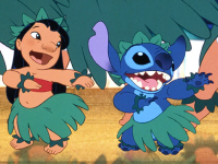
Have you ever seen Lilo and Stich? It's the first thing I thought of when I saw this. The big eyes, the non threatening expression, etc.


journey_citadel.jpg
 

I'm not sure who you're accusing of being passive aggressive. I never assume what people mean, especially in a text medium.
I was saying that your post was passive aggressive. Did I make an error? It sounded like you didn't understand that the poster you were responding to was commenting on the 'softer tone' of the illustration rather than some very detailed aspects of a Disney/Pixar product.
 

Have you ever seen Lilo and Stich? It's the first thing I thought of when I saw this.
Let's compare a whole picture to a whole picture since we're talking about an art aesthetic/STYLE here, not individual parts of a composition.

Your comparison does not appear to be very strong. The cover art for the new book is MUCH less stylized than Lilo & Stitch and adheres much closer to realistic human anatomy. They are not similar at all.

Just because the lemur is blue and stitch is blue doesn't mean it's the same art aesthetic.
 

Attachments

  • 1648131007220.png
    1648131007220.png
    599.1 KB · Views: 66

I was saying that your post was passive aggressive. Did I make an error? It sounded like you didn't understand that the poster you were responding to was commenting on the 'softer tone' of the illustration rather than some very detailed aspects of a Disney/Pixar product.
Like I said, I read the words and assumed as little as possible about them beyond what I needed to make the sentence make sense in common english grammar and vernacular. If he wanted to say "softer tone" then he should have said that.
 

Status
Not open for further replies.
Remove ads

Top