- Community
- Archive Forums
- Hosted Forums
- Personal & Hosted Forums
- Hosted Publisher Forums
- Eternity Publishing Hosted Forum
You are using an out of date browser. It may not display this or other websites correctly.
You should upgrade or use an alternative browser.
You should upgrade or use an alternative browser.
Immortals Handbook - ASCENSION
- Thread starter Upper_Krust
- Start date
- Status
- Not open for further replies.
Upper_Krust
Legend
Upper_Krust
Legend
One more, this is the same as the previous logo, except that it has a stronger highlight in the middle of the cross matching better with the rest of the text.
Although looking at it I wonder if I prefer the previous one, the cross looks a bit stronger in it.
Although looking at it I wonder if I prefer the previous one, the cross looks a bit stronger in it.
Attachments
Cheiromancer
Adventurer
How does it look if the cross is taller than it is wide?
If the serifs on the horizontal bar are more pronounced, you could get a stronger H effect.
I can more or less see the I, though it takes some familiarity with the logo. I don't think it jumps out enough. That said, get something- anything - out the door rather than have to wait a year.
If the serifs on the horizontal bar are more pronounced, you could get a stronger H effect.
I can more or less see the I, though it takes some familiarity with the logo. I don't think it jumps out enough. That said, get something- anything - out the door rather than have to wait a year.
Upper_Krust said:One more, this is the same as the previous logo, except that it has a stronger highlight in the middle of the cross matching better with the rest of the text.
Although looking at it I wonder if I prefer the previous one, the cross looks a bit stronger in it.
These variants, with the colour to split the parts of the text apart, look better. It may still suffer from a "only there if you're looking for it" thing, though: I dunno how many casual browsers will decipher it quickly.
Still, definite improvement.
Nifelhein
First Post
They look better, true, but there isn't any chance I can actually see the H unless I guess the book's name. I have made a quick work in Photoshop to incorporate the ideas i was giving, note the golden color in the H, it could be changed, golden to the Immortyal and yello to the Handbook, this would give the logo a clearer and more easily identifiable identity.
Of course I expect the guys to like it and you, UK not to, because the thing just does not look like a cross that much...
Anyway, it is there, one thing that may improve it is to accentuate the edges of the I (to the left and right at the top and bottom of the I).
Cheers,
Nif.
Of course I expect the guys to like it and you, UK not to, because the thing just does not look like a cross that much...
Anyway, it is there, one thing that may improve it is to accentuate the edges of the I (to the left and right at the top and bottom of the I).
Cheers,
Nif.
Attachments
Upper_Krust
Legend
Hey guys - thanks for the feedback by the way. 
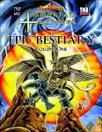
I have the cover almost completed. Its just a bit of tweaking at this stage and trying to work out the best font/texture/colour to read:
EPIC BESTIARY
Volume One
So I should be done in a few hours.
With regards the logo itself. I have it on the cover and it looks half decent, although the borders don't look strong enough so I need to go back and redo those.
Weird. Also then I would actually be losing the shape of the cross I was trying to represent in the first place.
But nice idea...then again you probably just want me to put a regular Crucifix on the cover don't you. I see through your game mate.
I don't have the time right now, and this certainly isn't the place but I was curious to hear your thoughts on the Pope's apology...maybe next time we bump into each other on msn messenger.
I want to try and have the serifs parallel those on the actual text.
Well exactly.
Incidently, I think I should be finished bt about 6pm. Which means I'll update on Friday. That way I'll have Wednesday night all Thursday and Friday morning (I'm busy Friday afternoon) to work on it. I am sure I can get something worthwhile done.
I have the cover almost completed. Its just a bit of tweaking at this stage and trying to work out the best font/texture/colour to read:
EPIC BESTIARY
Volume One
So I should be done in a few hours.
With regards the logo itself. I have it on the cover and it looks half decent, although the borders don't look strong enough so I need to go back and redo those.
Cheiromancer said:How does it look if the cross is taller than it is wide?
Weird. Also then I would actually be losing the shape of the cross I was trying to represent in the first place.
But nice idea...then again you probably just want me to put a regular Crucifix on the cover don't you. I see through your game mate.
I don't have the time right now, and this certainly isn't the place but I was curious to hear your thoughts on the Pope's apology...maybe next time we bump into each other on msn messenger.
Cheiromancer said:If the serifs on the horizontal bar are more pronounced, you could get a stronger H effect.
I want to try and have the serifs parallel those on the actual text.
Cheiromancer said:I can more or less see the I, though it takes some familiarity with the logo. I don't think it jumps out enough. That said, get something- anything - out the door rather than have to wait a year.
Well exactly.
Incidently, I think I should be finished bt about 6pm. Which means I'll update on Friday. That way I'll have Wednesday night all Thursday and Friday morning (I'm busy Friday afternoon) to work on it. I am sure I can get something worthwhile done.
Upper_Krust
Legend
Ltheb Silverfrond
Explorer
U_K!
Cover looks awesome!
The "H" is still a bit un-noticable, but I think it's fine; The cover will grab the readers attention enough.
Also, on the final High-resolution copy you send to the Publisher, will it contain the slight gray haze around the "Immortal's Handbook" Lettering? (As seen around the outside edges of the black outline.) It lookes like a bit copy-paste. I didn't notice it innitially, which means its probobly either the Low-res scan blending pixels in ways it shouldn't, or its so small on the final copy it won't matter.
As for a friday update: Cool. At least the bestiary headache is over and done with. (Heh, again) Quite a bit of typing to do I would guess, filling in the write ups for all the divine and Cosmic abilities, while largely copy-paste formating, seems like it would be easy to skip something.
- Status
- Not open for further replies.
Similar Threads
- Replies
- 12
- Views
- 5K
- Replies
- 37
- Views
- 9K
- Replies
- 204
- Views
- 35K
- Replies
- 12
- Views
- 4K
Recent & Upcoming Releases
-
June 16 2026 -
June 16 2026 -
September 16 2026 
Arcana Unleashed(Dungeons & Dragons)
Rulebook featuring "high magic" options, including a host of new spells.
Replies (250) -
September 16 2026 -
October 1 2026 -
October 6 2026 -
January 1 2027 -
January 1 2027


