• NOW LIVE! Into the Woods--new character species, eerie monsters, and haunting villains to populate the woodlands of your D&D games.

Immortals Handbook - ASCENSION

Status
Not open for further replies.
Very Early Logo Build...

Hey all,

Okay, here is something I knocked up fairly quickly in Paint Shop Pro. Its probably not the font I will ultimately use, but basically I just want to know if ithe combined I & H is legible enough...?

I think I'll be looking for a font that is broad rather than tall. Since the size of the combined IH is determined by the height of the font.

Those textures are makeshift, and I am thinking about a backboard of some kind for the text (as if its a plaque to be mounted).
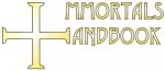
 

Attachments

  • IHLogo1.jpg
    IHLogo1.jpg
    14.8 KB · Views: 114

log in or register to remove this ad

Look at that last font, you can see that you need a wider font rather than a tall font.

I think this one looks a touch better. But I'll still need to go through a few until I find exactly what I am looking for.
 

Attachments

  • IHLogo2.jpg
    IHLogo2.jpg
    20.5 KB · Views: 103


Errrr... it jsut looks like Mmortalls Andbook to me, the I could possibly get to my sight but the H, as is, just don't egt to me at all. For the I it is just a matter of moving mmortal closer to the vertical piece and changing the cross to a two piece thing, meaning one vertical and one horizontal, maybe with color difference too.

If you use soemthing like a cross of malta for the H and common cross for the I it would get even better, you would need to give some emphasis on the edges of the cross of malta to the upper and lower directins though.


The H is pushing it, I think. Stretch out the serifs on the left and right ends of the cross a bit more, and I think you could pull it off.
 

As with what others have said, the "H" is a rather difficult read. The "I" is much clearer. Perhaps if the left and right "arms" of the "+" were shorter, and the embelishments that form the vertical bars of the "H" were longer it would be clearer.
The shading looks nice though.


Upper_Krust said:
Hey GQuail mate! :)

And hello again, to you, sir. :-) Sorry it's been a while since I rambled - I only ever seem to come in to complain. Typical Scotsman. ;-)

Upper_Krust said:
You have answered your own question ~ I simply can't magic it out of thin air and if I don't get the Bestiary finished for Thursday I'll probably have to give up on the rest of the series for about a year, because I can't support myself on the pdf sales alone (Don't worry I'll still finish Ascension in such a case).

It wasn't a question, exactly: I'm not saying "do it now", because I now that's unfeasable, but you have to understand that as a customer it's yet another dissapointment. No matter how logical I know it is, or how much I empathise with you, or how much I know you're kicking yourself as well. :-)

Upper_Krust said:
Possibly, because I run out of money in approx. 4 weeks (or as far as I can stretch £78) which means sometime before then I'm going to need to get myself a part time job.

That is something of an incentive, yes. :-/

At the end of the day, you need steady cash to live, and if you aren't alive, you won't be writing no Immortals Handbook. There are few people in the RPG industry who don't draw a wage from somewhere else, after all: especially in the PDF crowd.

Upper_Krust said:
The problem is that I want the update to represent a marked improvement. 0.8 didn't and I felt bad about it, this one has slightly more done than that, but in my eyes its basically nothing overtly new.

Aboslutely, there's no point in releasing a "new improved" version when there's not really anything new or improved. (Calling it 0.85 might stem that slightly, rather than kicking the numbers up every time - I know the discussion of Beta 1.1+ got a few eyebrows raised, since earlier 1.0 had been planned as the final, art-filled edition.)

Anyway, it's time for me to stop warbling and look at the new logo, hopefully I can be constructive for a change. ;-)
 

Nifelhein said:
Errrr... it jsut looks like Mmortalls Andbook to me, the I could possibly get to my sight but the H, as is, just don't egt to me at all.

Pretty much how I feel: the I isn't obvious at first glance to me, and the H just flat out doesn't exist. Someone can puzzle out what it means, sure, but a Logo should not usually require you to stare at it for a bit to work out what the product is. ;-)

However, I do like the general idea. Combining the I and H into some other sort of symbol might work: like others said, perhaps expand the legs on the horizontal bar of the cross?
 

Status
Not open for further replies.

Into the Woods

Remove ads

Top